
Enrollment Strategy


By Angela Brown, Head of Marketing
If a graduate program page doesn’t immediately tell a working adult whether the program fits their career goals, their schedule, their academic background and their budget, they’re out. They don't email you to ask, they close the tab.
Pages that answer those four questions in the first screen convert while pages that hide the answers behind navigation, PDFs or an inquiry form don't. A form that’s built to guide someone toward an answer, instead of collecting a name, extends that same helpfulness into the communications that follow.
That's the short version. Here's how the decision plays out, and what you can change in the next 30 days.
What a working adult is deciding in the first 15 seconds
A 34-year-old operations manager reviewing an MS in Data Analytics at 9:40 p.m. isn't reading your program page. She's scanning it against a single question: can this advance my career without upending my life?
She's also doing it with five other tabs open, on a phone, between one obligation and the next. Halda and NAGAP’s 2026 Graduate Enrollment Trends report found that for 60% of surveyed graduate students, visiting an institution's website was the first thing they did after starting their search. Another 17% got there within a few days. The program page is the first real interaction, and often the only one for a while. Only 13.3% of surveyed students said they always spoke with an admissions counselor before applying.
Add one more thing: 73.3% weren't planning to attend the institution where they earned their undergraduate degree. You have no relationship equity to draw on. The page carries the whole load.
For a lot of graduate prospects, your program page isn't part of the enrollment experience. It's the entire enrollment experience.
Seven questions your graduate program page needs to answer fast
These are the questions working adults are running through during that initial scan. If an answer requires a search, a PDF download or a call to a general admissions line, it might as well be missing entirely.
.avif)
Three rules for using this table. Put the answers in the body of the page, not in a global admissions section three clicks away. Lead with a specific value proposition that names the degree, the audience, the format and the timeline. And replace words like "innovative" and "transformative" with something a skeptical reader can verify: a course sequence, a faculty member's employer, an accreditation, a placement figure, etc.
We covered the underlying page mechanics in The Enrollment Conversion Playbook, which walks through hierarchy, load time and above-the-fold structure for any program page. This piece picks up where the audience is a working adult and the decision is a five-figure investment of money and evenings.
Thin program data reads as a warning sign
Thin program data is the version of your page that technically describes the program without helping anyone make a decision. It shows up as:
- A program description that never explains what the coursework involves
- "Online" with no detail on live sessions, residencies or pacing
- Faculty names with no context about their expertise or industry background
- Career-outcome claims with no roles, employers or numbers behind them
- Tuition that requires a second search to find
- Admissions requirements and deadlines living on a different page
- An inquiry form that gates the basics instead of offering a useful next step
Here's why that costs you more than it used to. Prospects researched 5.1 programs on average in 2026, down from six in 2025, and applied to 4.3 of them. The consideration set is smaller and the decisions are firmer, so a weak page doesn't get a second look later in the cycle. It just doesn't make the list.
There's a second cost that's harder to quantify. When someone can't find a basic answer about schedule or cost, they draw one of two conclusions: the answer is bad, or your institution will be this hard to deal with after they enroll. Neither one ends with an application.
Lead with program quality, then be direct about cost
Students in Halda and NAGAP’s research ranked program strength first among external decision factors, followed by faculty quality and institutional reputation. Financial aid and cost came next. Graduate enrollment professionals surveyed in the same research ranked cost first.
That disconnect matters for how you order the page. Enrollment teams, worried about sticker shock, sometimes lead with affordability messaging and bury the substance. For this audience, prospects want the substance first, then the numbers.
Being direct about cost is more urgent now than it was a year ago. Grad PLUS loans ended for new borrowers on July 1, 2026, and federal borrowing for general graduate programs is capped at $20,500 a year and $100,000 in total, with higher limits for the 11 statutory professional fields. A working adult who used to be able to cover the full cost of attendance with federal loans now has to assemble a funding plan before applying. Per-credit tuition, an estimated total, employer tuition assistance guidance and scholarship information are decision-critical content this cycle, not fine print.
Make the form help before it asks
The typical inquiry form is where a helpful website stops being helpful. It requests contact information before offering anything in return, it turns a live question into a static lead record, and it hands your team a row of data with no context about what the person wanted. Then the follow-up email is generic, because there's nothing to personalize with.
A better version starts with the prospect's question instead of your fields. Instead of "complete this form," the first prompt is closer to "what are you trying to figure out about this program?"
Here's how that runs in practice:
- A visitor selects: "I need to know whether I can finish this while working full time."
- The experience asks two or three useful follow-ups: preferred schedule, online or hybrid, target start term.
- It returns the relevant format and pacing information right there, before asking for anything else.
- It offers the next most useful step, and the prospect chooses a channel to continue on.
- What she declared, including her career objective, format preference and start term, shapes every message after that.
Halda's AI forms can run this on the page with content that speaks to what a visitor is looking for instead of serving everyone the same block. What she tells the form travels with her into subsequent website visits, email, SMS and voice, and Halda can escalate to a counselor when the question needs a person. Because the platform learns with every interaction, the second conversation starts where the first one ended.
One note for anyone evaluating this internally: don't sell it as a smarter form. Evaluate it on whether it reduces uncertainty at the moment someone is deciding whether to keep going, and judge it on appointments, application starts and yield instead of form-completion volume.
The difference shows up first at inquiry-to-application
At a mid-Atlantic public university, graduate inquiries who engaged with Halda applied at 73% in Fall 2025. Graduate inquiries who didn't applied at 33%. That's a 40-point difference in the one metric that tells you whether the page and the follow-up did their job.
That impact carries downstream. At a midwestern private university, graduate admits who engaged with Halda deposited at 84.2% against 59.8% for those who didn't. A southern private university saw graduate admit-to-deposit run 66.7% versus 55.2% in its Fall 2026 point-in-time read, after 80% versus 64.3% the prior cycle.
Read all three as directional rather than controlled. These compare students who engaged with Halda against students who didn't, which means engagement itself is part of what's being measured. The consistency across institutions, funnel stages and cycles is the useful part.
Follow-up that reaches a working adult on their schedule
Graduate prospects want relevant responses more than they want instant ones. In Halda and NAGAP’s research, 76.6% of surveyed students rated a personalized answer as highly important to their decision. Only 54.9% said the same about a fast answer.
The target is both. Prospects in the research waited an average of 3.6 days for a response to an online inquiry, and only 6.1% got a same-day reply. Among students who did receive personalized outreach, 78.9% said it helped them decide where to apply, while 41.1% said institutions rarely or never sent them anything personalized.
Speed without relevance produces a fast but forgettable email. Relevance without speed arrives after the decision. What context from the on-page conversation makes possible is a response that's prompt and specific, because the system already knows what she asked.
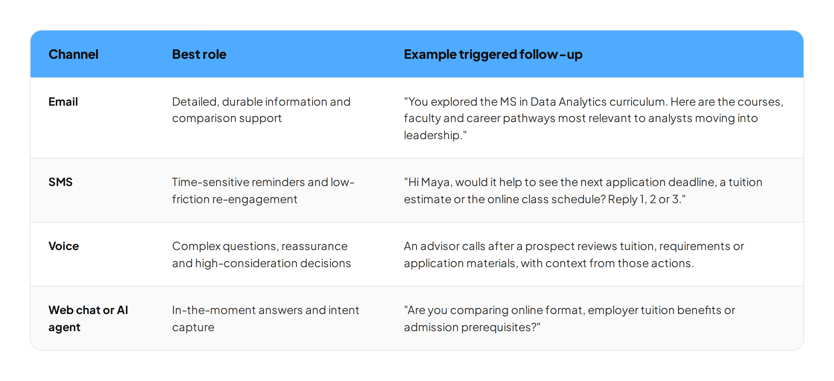
The rule across all four: never make a prospect answer the same question twice. A working adult who explains her schedule constraints on the page at 9:40 p.m. and gets asked about them again by an advisor two days later has learned something about how your institution operates.
What to measure
Inquiry volume tells you almost nothing about whether the experience helped anyone. These five objectives tell you more.
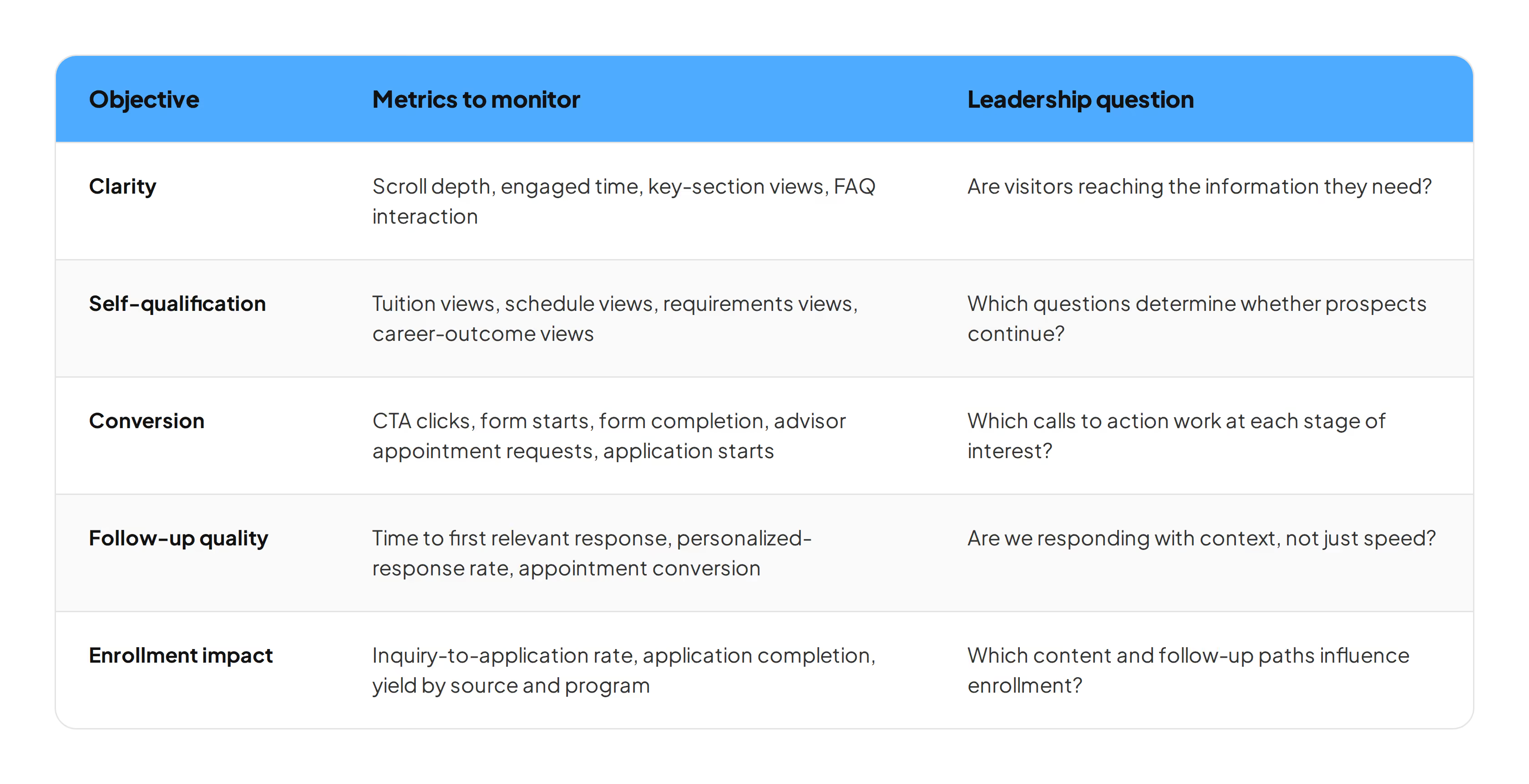
There's an organizational problem lurking behind this. Halda's research found that 68.7% of graduate enrollment professionals lacked comprehensive access to their own website data, and 53% needed another department's approval to update admissions content. A team that can't see behavior and can't edit the page can't improve conversion no matter how good the plan is. If that describes your situation, the access conversation comes before the optimization work.
A 30-day plan
Week 1: Diagnose. Pick your five highest-priority graduate program pages. Score each against the seven questions above and mark every answer that's missing, buried in a PDF or living behind the form. Pull exit data and form-start data for each page.
Week 2: Fix the page. Add a program-at-a-glance block covering format, length, start terms and cost. Surface schedule, outcomes, faculty, requirements, tuition and deadlines in the body copy. Swap vague adjectives for evidence.
Week 3: Build the guided paths. Identify the three to five questions that determine whether a working adult keeps going, usually schedule feasibility, total cost, prerequisites and career outcomes. Build a path for each one that answers before it asks, and capture only the context that will improve the next interaction.
Week 4: Connect the follow-up. Map each declared need to the right first message and channel. Set a service-level target for time to first relevant response, not just first response. Report on appointments, application starts and enrolled students.
Common questions about graduate program page conversion
What do working adults look for first on a graduate program page? Schedule feasibility and career relevance, usually in that order. They're determining whether the program can fit around a job and whether finishing it changes their professional situation. Cost matters, and it comes into focus once those two are settled.
How many programs are graduate prospects comparing? Halda and NAGAP’s research puts it at 5.1 researched and 4.3 applied to in 2026, down from six researched in 2025. Consideration sets are tight, so a page that fails the first scan generally doesn't get revisited.
Should tuition be on the program page? Yes. Per-credit tuition, an estimated total, aid options and employer tuition assistance guidance all belong on the page. With Grad PLUS eliminated for new borrowers as of July 1, 2026, working adults are building funding plans earlier, and a page that withholds cost information loses them to one that doesn't.
Do AI forms produce fewer inquiries? They typically produce better-qualified ones. The prospect declares a career goal, format preference and start term, which gives the follow-up something specific to work with. At a west coast private university, Halda-sourced applicants to the Doctor of Nursing Practice program were admitted at 86% against 50% for applicants who came in another way, in a cycle that's still open. Judge the change on inquiry-to-application rate, admit rate and appointment conversion rather than raw form volume.
Start with the page a working adult is looking at tonight
The 73% versus 33% apply rate in that mid-Atlantic graduate pool didn't come from more traffic. The same inquiries were already there. What changed was whether the page answered the question the prospect arrived with, and whether the follow-up remembered the answer.
Pick the graduate program page with your best traffic and your worst inquiry rate. Read it at 9:40 p.m. on your phone, the way she will. Whatever you can't answer in 15 seconds is what's costing you the application.
.avif)
________________
As Halda’s Head of Marketing, Angela Brown brings more than 15 years of experience leading marketing and content teams in education and B2B SaaS. When she isn’t at her computer, you can find her reading, watching a true crime documentary, or driving her son to basketball practice.


.avif)